


Doesn’t matter whether you are an entrepreneur looking to raise funds, a corporate professional ready to present your ideas to senior management, or an agency preparing your great marketing services pitch to your clients, all end up preparing a presentation deck. I know you sometimes hate it, but presentations still exist because it’s a great way to put forward your messages and ideas in a concise manner.
Now, though we understand that presentation slides are a common medium in which a lot of long-form detailed ideas are presented, most of us still struggle with creating a compelling presentation deck that can retain the attention of the audience and can effectively put across the message it is trying to convey.
According to biologist John Medina at the University of Washington School of Medicine, audiences mentally check out from your presentation after 10 mins. In other words, the attention span is short and is getting shorter as we are getting exposed to ultra-short-form media content in our daily lives.
Great presentations are made up of 3 important pillars– Content, Design, and Verbal Presentation. Effective use of all three can craft a great winning story. Today we are going to focus more on the second pillar which is Presentation Design.
What is Presentation Design?
Presentation design is not just using fancy elements and creating a jazzy-looking deck with all the colors and images. A good presentation design ensures that the end objective of attracting the attention of your audience and retaining them is met. In addition to this, a good presentation design ensures that the whole slide deck looks balanced in terms of content size, visual hierarchy, and use of various elements including fonts, colors, layout, etc.
Forms of Presentation Design
Based on the objectives of the presentation, creative slide design comes in various forms including investor pitch presentations, educational presentations, webinar presentations, report presentations, sales presentations, inspirational presentations, and keynote presentations. We will cover in more detail about all these forms in our future blogs, however, just note that the fundamentals are always the same.
Designing Effective Presentations
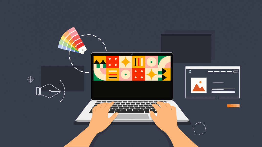
Creating effective presentations means outlining a visual story that must speak for itself before you add your verbal elaborations to it. While our designers here at Doodl Space are equipped with all the skills and creativity to turn your slide design into a heart-winning one, here are a few tips that you can follow when you or your designer is creating a slide deck.
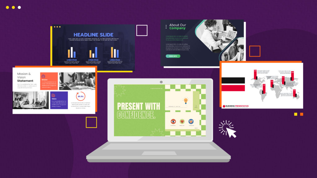
- Use visual cues like image or illustration in the title slide that helps re-establish the title firmly in the mind of your audience
- Keep all the slides synced to each other to avoid distractions. The layout, color scheme, fonts, and other elements should be the same throughout all the slides.
- Do not use more than 2 fonts in the entire slide deck
- Keep in mind the hierarchy of your content. Properly highlight the titles and the important pointers like data so that you get the eyeballs where you want them first in a sequence.
- Don’t be too text-heavy. This is the mistake most people make as per our experiences. You must know that there is limited space in the whole slide, and the audience also is never interested to peek at your screen to read the whole story. So no matter how tempted you are to put everything you want to say, you just make every point crisp in a few words. Leave the rest of the explanation to the verbal presentation or just create a note so that the audience can read it later. Use fewer texts and allow more visuals to take their place
- Do not overuse transitions or animations. The more you use animations the more you distract your audience from the main content.
- For bullet points or multiple small pointers, either use simple icons or ask your designer to design relevant illustrative icons to represent the matter you want to convey
- Mind the color contrast and font size. Your audience will be sitting at some distance from your presentation, hence you need to make sure they can clearly read what you have written there on the slides
- Don’t look too dull. Plain can be boring. A creatively designed presentation can keep your audience awake and interested throughout the presentation.
Trends in Presentation Design
With design trends seeping into almost every type of design, how could presentation design be possibly left out? Here are a few types of presentations that has been catching eyeballs in 2022 and possibly will keep doing the next year as well.
Minimalism
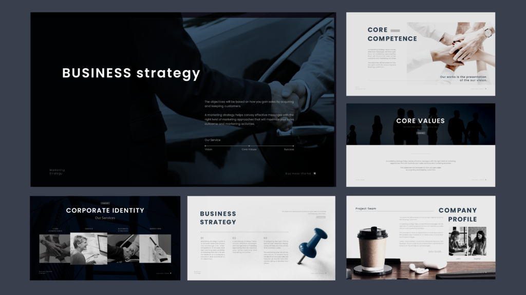
Featuring subtle hues and design elements that aren’t jarring, the minimalism trend has caught onto presentation design as well. Using simple colors and symbols with just a bold highlight of your most significant points, a minimalistic presentation can work wonders for you.
Neon Lights
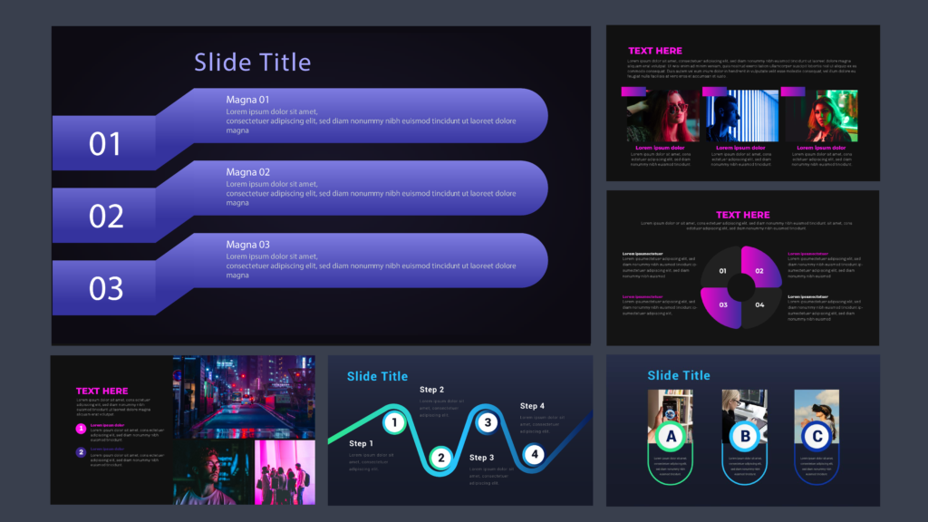
I might understand your concerns with this one but trust me. Neon graphics on a dark background are the way to go when it comes to brands that are creative and not too corporate in their identity. Dark backgrounds with a combination of neon lights can give you an ultimate creative edge when playing with multiple colors or gradients in your slides.
Infographic Presentations
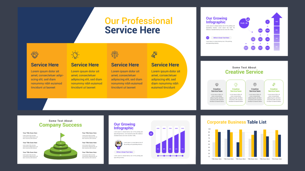
Infographics are always a key part of any presentation design. It not only helps you to cut long stories short or get your content arranged better but also helps you in crafting great visual stories out of your data or other content formats.
The role of creative graphics in Presentation Design

While it may seem unnecessary to get graphics created for your presentation, it takes your communication to a whole new level, and here’s why.
- When it comes to pitching your brand, remember that it’s always the visual game that supplements your oratory and presentation skills. Your brand gains confidence when it is visibly a lot more appealing and clear.
- Visuals have a larger power in communicating the right content when compared to bulky text. This is why visuals can be better received while giving a presentation.
- Visuals can be retained longer in memories. So imagine you are pitching an investor to take interest in your startup. A creative presentation can be retained longer in their head while they choose between you and a lot of other presentations they had that day
- Good design establishes a visual hierarchy that helps separate the importance of each message and element in your presentation design according to its relevance.
- A clear call-to-action is always integrated better with creative design, thus enabling you to push your end goal into the audience’s minds.
From what I’ve written till now, presentation design delivers the power to evoke emotion and interest in your audience. When designed effectively, it can help feed even the most cumbersome of data into the viewer’s mind, thanks to the power of visuals. I hope you can make use of this and create great presentations that win hearts and minds. However, if you want to focus on your content and leave the design to experts, we’ve got you covered. With Doodl Space Graphics+ subscription, you can get creative presentation designs without any sweat. Just share the content with your designer today and receive a well-designed presentation in a couple of days. You can get the designs in PowerPoint or Google Slides as well. Book a call to discuss your next presentation project with us.


Nice Post