


The power of presentation design in creating a stellar image for your brand wherever you end up pitching it is phenomenal. With a great presentation design, an organization can easily win the trust and confidence of its investors, patrons as well as employees, and we’ve already established that in our blog titled ‘Your Ultimate Guide To Presentation Design’, you’d rather not see us going gaga over the importance presentation design here as well.
Just to give you an idea of our authority over writing this do’s and donts blog, we at Doodl Space are a team of experienced creative graphic designers who provide 360-degree design services for your brand at an affordable & flat subscription rate. Our design services are efficient, hassle-free and unlimited- and we do take a little bit of pride in doing things the right way when it comes to presentation design as well. So let’s go ahead and skip to the part where we, as designers, give you an insight on the dos and donts of presentation design you should know when you get your next presentation deck in order!
The Do’s and Donts of Presentation Design: The Ultimate List
Be it presenting to a new client or pitching invistors for your next funding round, your presentation design needs to play the part of putting across the right information, in the most visually befitting format, and here’s the ultimate list of what you should and should not do when it comes to your presentation layout.
Stick To A Theme
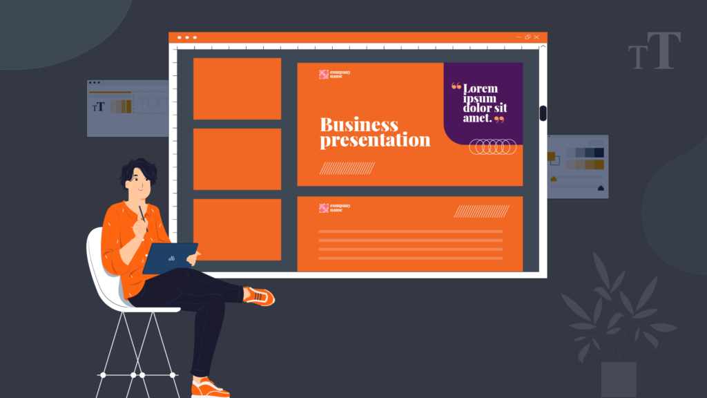
Presentation themes that are unified across the entire presentation look much more professional, as opposed to using a varied set of backgrounds, fonts, bullet points and colors for each slide design. Overdesigning a presentation with a slew of colors and variations can make you look unprofessional and even indecisive as a brand. The best way to design a presentation is to stick to your brand colors, or stick to classic color combinations to avoid overwhelming your audience.
Start Right

The title slide of your presentation should ideally set the entire mood for what’s to come next. A pleasing, minimal and to-the-point title slide readies the audience and grabs their attention without throwing them off. Make sure the first slide of your presentation is minimal and not too busy. Choose an image or design here, which somewhat relates to your topic so that you can make the audience connect your title to your featured image or design.
Keep It Readable

A lot of presentations feature complicated fonts that look good, but have zero readability. This is a big ‘don’t’ when it comes to presentation design where the sole purpose of the text is to help your audience understand the subject matter better. Cursive caps of fonts, and outdated fonts such as Comic Sans, Times New Roman and Andale Mondo are to be steered clear off. In presentation design, always use fonts that are legible and easy-to-read at one quick glance without having to strain anyone’s eyes or brains.
Don’t Overload Your Slides

Keep the text on your slide design minimum, and use visual elements to explain certain topics. Remember that you’re only using the text in your presentations as a supplementary information to what you’re actually speaking. Keep only the most important pointers, numbers and statistics on your slide design, and take away the bulky content. Instead, let your audiences focus more towards what you actually have to say.
Create Visibility

Creating a contrast between your font color and the background color is everything. Readability will only come from distinct text colors set against a contrasting background, leaving no scope for the text blending into the background. To do this, consider using hues of neutral colors for backgrounds and always choose a darker or a black font for contrast.Â
Photographs Are Last Season

Unless very necessary, using stock photos in your presentation layout is the tackiest thing to do with today’s design advancements at your fingertips. Instead of adding stock photos front and center, prefer to put them at the back, with a vector or design element as the center-stage of your presentation theme. Using appealing visual elements and aesthetics can create a unique image for your brand, and Doodl Space can help you with the most appealing designs that don’t look forced.
Use Negative Space

Negative space or white space is an area on the slide layout where there are no text or visual elements. Consider these spaces as more of a breather. These negative spaces are an important functional element of your design. They help clear up the layout so that the audience’s eyes are drawn only to the most important parts without diverging any attention to unnecessary elements.
Make Your Audiences Feel Involved

As you go from slide to slide, you may loose the attention of your audiences, and that’s natural. To avoid this from happening, make your audiences feel engaged with the balance of great speech delivery and appealing presentation design that never lets attention slip away. Include videos and infographics in your presentation, pose questions through the presentation and keep your audiences on their toes with engaging scripts.
And there you have it, the most effective do’s and don ts of presentation design that we swear by, here at Doodl Space.
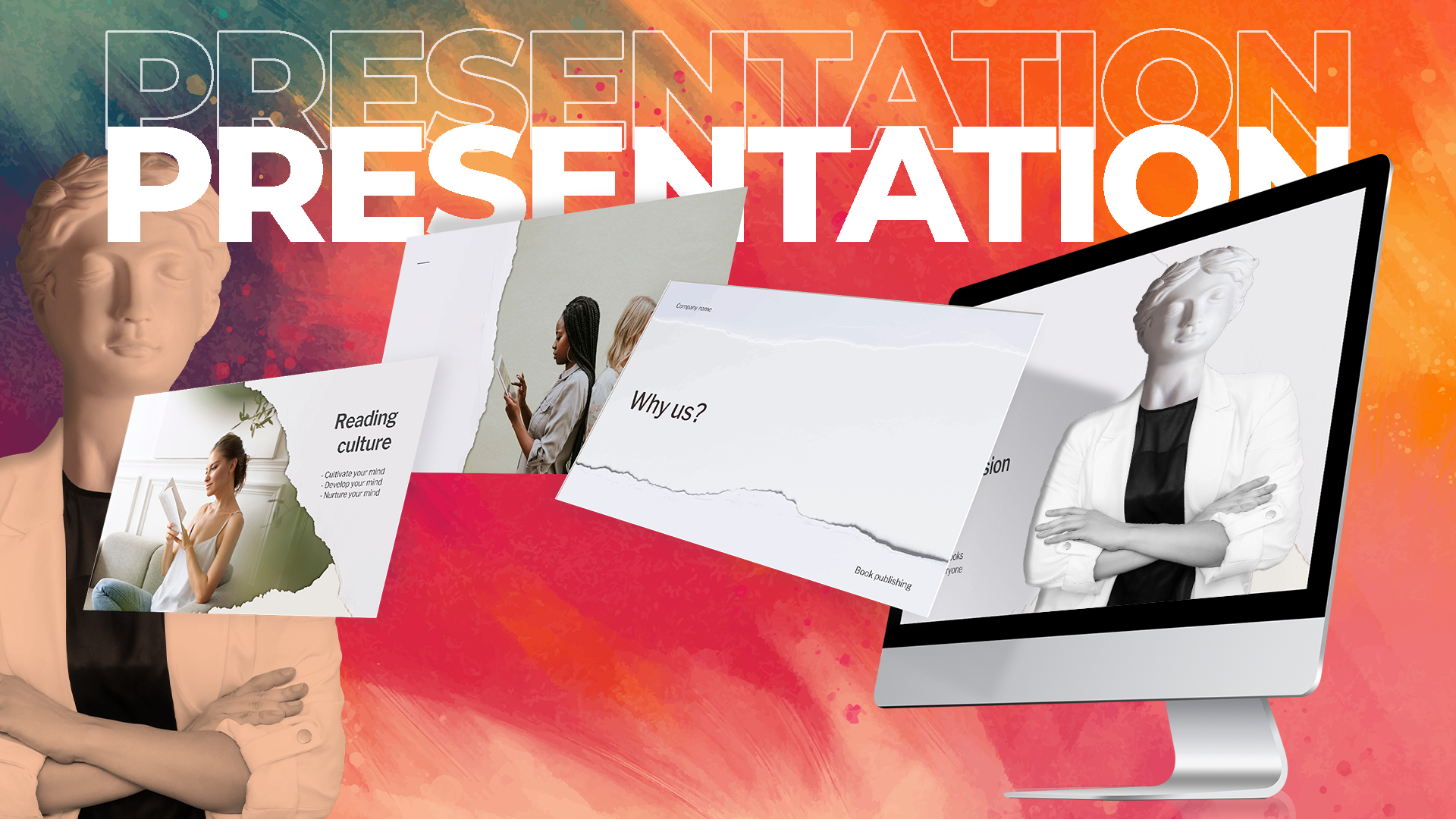
Graphics and Presentation Design: A Match Made In Corporate Heaven
A dull and drab presentation can always be spiced up and taken to a whole new level professionally, with the addition of graphics. Using graphics in presentation design not just elevates your communication, but also creates a bigger and better impact on your audiences, who seem to be drawn toward what your brand has to offer.Â
At Doodl Space, we integrate the best of graphics into your presentation design, in order to cast a striking brand impression on your audiences- ultimately leading to a positive outcome for you. Reach out to us today for an affordable, hassle-free, and efficient design subscription with utmost creativity and no limitations. Let’s start creating, today!


comment 1