Fonts- we see, read, use, and love them. But, have we ever dabbled into the question of understanding fonts? Commonly associated with the mood and tone of the text in question, fonts can quickly elevate a design, which makes font design a brilliant subject matter to explore in the world of creative design.
Typographies used in graphic design most often set the entire tone of a creative design, helping it speak for itself. As it stands, typography or font design is one of the most important tools needed while creating creative visual messaging, and here’s a rundown of the world of graphic design fonts and how to use them.
What Makes Understanding Fonts So Important
Up until now, if you haven’t really put much thought into understanding fonts, now is the time. If you’re not a graphic designer, this might not seem like your problem, but being the head honcho of a business, you might want to read on, since fonts are what really carry your communication in terms of marketing your brand and products the right way.
To put it in the simplest of terms, the sole purpose of font design is to present text in a way that enhances the experience of reading it and helps portray the emotion behind it. Graphic design fonts are as important as the design in itself since they complement the visuals in a way that really helps you connect with your targeted audiences.
Font-style designs have the wonderous ability to alter the experience of reading something, making it easier to consume the piece of content, without leaving gaps in communication.
When chosen optimally, graphic design fonts deliver the right emotions to the reader and bring words used in a creative design to life. All this with the added advantage of accurately reflecting the industry it is intended for.
To give you more insight into why we’re obsessing over the importance of font design, here are four reasons why the right graphic design fonts are a game-changer.
- The Whole Mood: Be it a humble, serious, or fun piece of content, different types of fonts are what really sell the emotion or mood you want to portray through the design.
- A Hierarchy of Information: It is possible through effective font design to categorize the texts inside content according to their importance. At Doodl Space, our designers make use of different types of fonts and sizes to differentiate the texts that are most important. Thanks to typography design, audiences can determine the information they should pay more attention to.
- A Touch of Professionalism: The difference between a rookie design and an appealing one is the correct use of graphic design fonts. Appropriate use of text font and size gains the trust of customers and adds value to your marketing efforts.
- Builds Better Association- A font design that is commonly used in your designs sets the tone for your brand and helps audiences associate with it instantly- creating sort of a creative trademark of sorts.
Understanding The Terms Used In Font Design
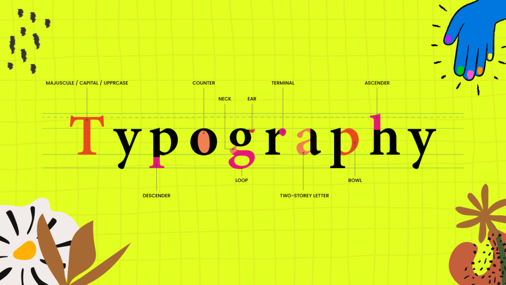
First things first, before understanding fonts and how they work, it’s important to learn the nuances of graphic design fonts with the five most commonly used font design terms.
- Typeface – Typeface is a broad term used for a group of some of the most popular types of fonts that include the recognizable Times New Roman, Helvetica, Garamond, Comic Sans, and hundreds of others.
- Font – Although the term ‘font’ is used as a synonym for ‘Typeface’ and ‘Typography’, it is, in fact, an umbrella term for the variations within a typeface, a font can be determined as bold, condensed, italic, and many others.
- Kerning – Kerning is the process of altering the spaces in between the letters belonging to the same word.
- Serif – A serif font is a font in which the letters have serifs, which are the seemingly tiny “feet†that some letters have on the ends of their lines. To give you an example, Times New Roman is a serif typeface, which means the letters have these ends.
- Sans Serif – If you can put two and two together, you’re in luck, because Sans Serif includes a broad spectrum of fonts that come without serif or any extra elements at the bottom of the letter.
Apart from these most commonly used terms in font design, a lot of other factors like line spacing, line break, paragraph break, letter spacing, hanging indent and several others come into play, but maybe we should let the creative design pro’s her at Doodl Space handle them while crafting epic designs for your brand.
How To Use Fonts The Right Way
While our expert designers at Doodl Space know just the right ways to make use of typography to create the best creatives that suit your brand and help attract the most relevant audiences, here’s a guide on how to make use of creative fonts effectively.
Readability Is Prime
Your creative typography might go to waste if it loses its readability. If your creative is text-heavy, it is always wise to use serif and sans serif fonts, which are generally more readable. Other typography tips to remember when making a design more readable are to feature a very high contrast in the colors. This can involve keeping the background dark, keeping the text in a color like white, and refraining from the use of upper case text.
Optimize Creativity
Instead of keeping everything plain Jane, use creative fonts, and mix up the sizes of the different parts of the text, maybe to form a geometric shape or any other interesting element. Creating a geometric block of text also makes it a lot more eye-catching since it’s out of the ordinary and demands attention.
Same Creative, Different Fonts
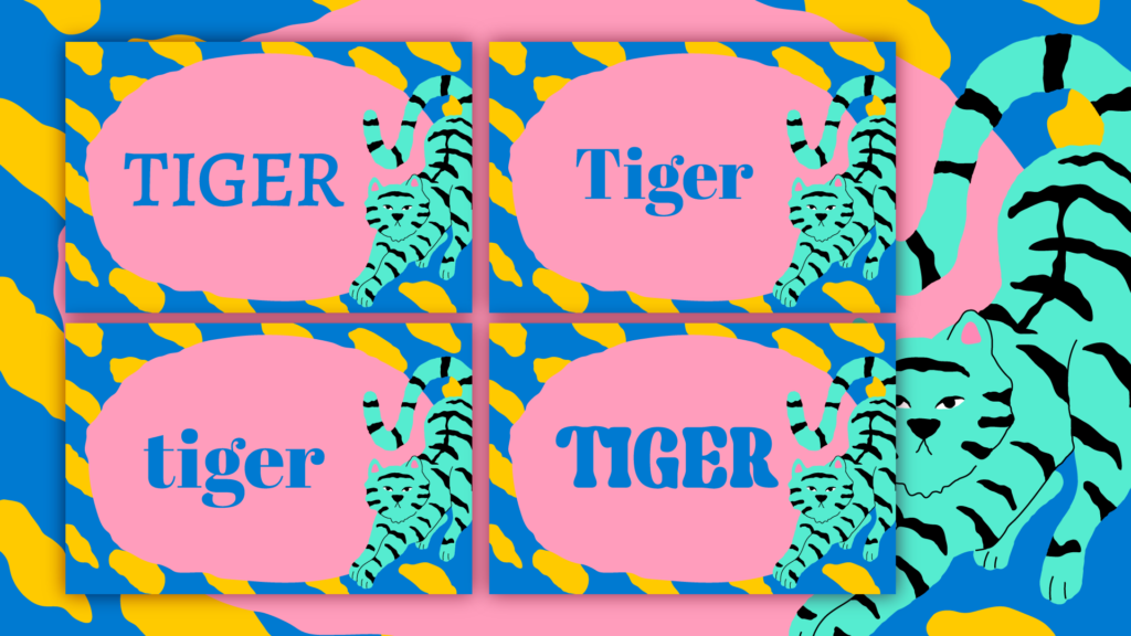
Another great typography tip is to use contrasting font style designs that involve striking titles and interesting body copies. Featuring different font styles in the same design help break the monotony, and give the creative a better overall flavor that’s easier to consume. This contrast can also be put to use with different use of line and letter spacing, and by contrasting fonts further with the use of Bold, Italics, Underlines, and more.
The Right Color And Style
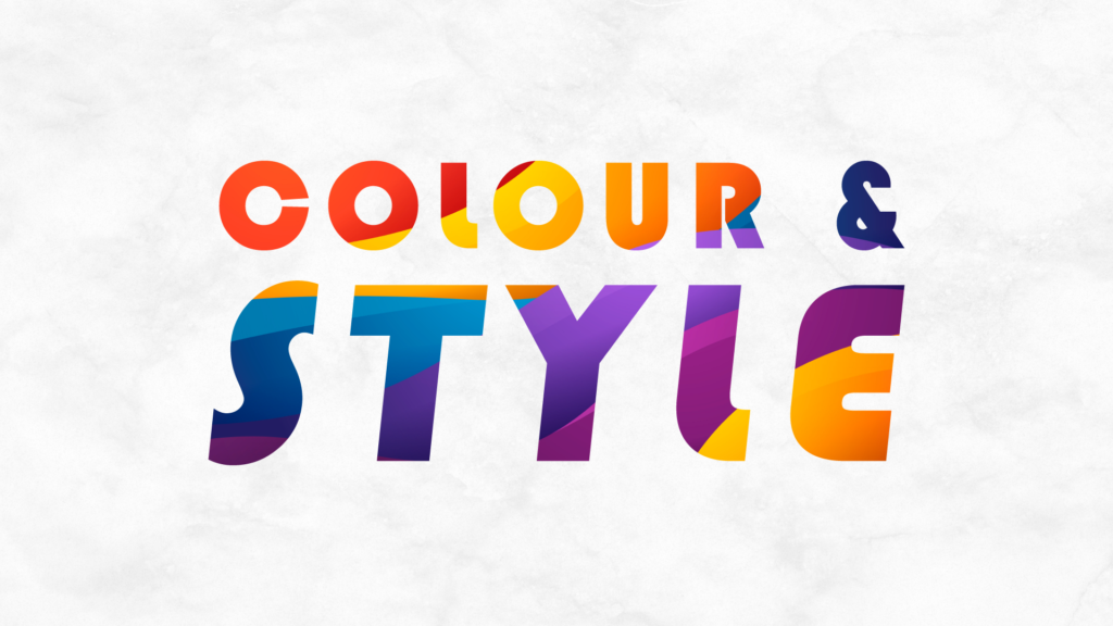
The rules of color psychology largely apply to graphic design fonts as well. This is why the usage of different typography colors, and styles, evoke varying moods amongst your audiences. So, it is always a good idea to choose font colors that are consistent with the tone evoked by both your font styles and your overall design. To give you an example- colors like yellow or orange can convey whimsy and cheer, while blue can be used can evoke sensibility.
At Doodl Space, we not only help you in setting ideal primary and secondary typographies for your brand but also make sure to maintain consistency in your creatives. If you need a custom typography/font for your brand, our designers are capable of illustrating the same for you.